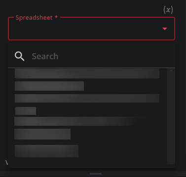
When configuring pieces related to Google Workspace you currently get one huge drop-down with all files in your account. This creates a fairly claustrophobic interface, especially with longer filenames:

Without the folder structure it can be really tedious to find the right file, even with the search, bonus points if there’s multiple files with the same name. As far as I can tell they’re ordered by “recent-ness”, but there seems to be a delay.
I suggest using the Google Picker API for this functionality. It delegates the “finding of files” to Google Drive itself, which results in a more streamlined and better integrated experience.
